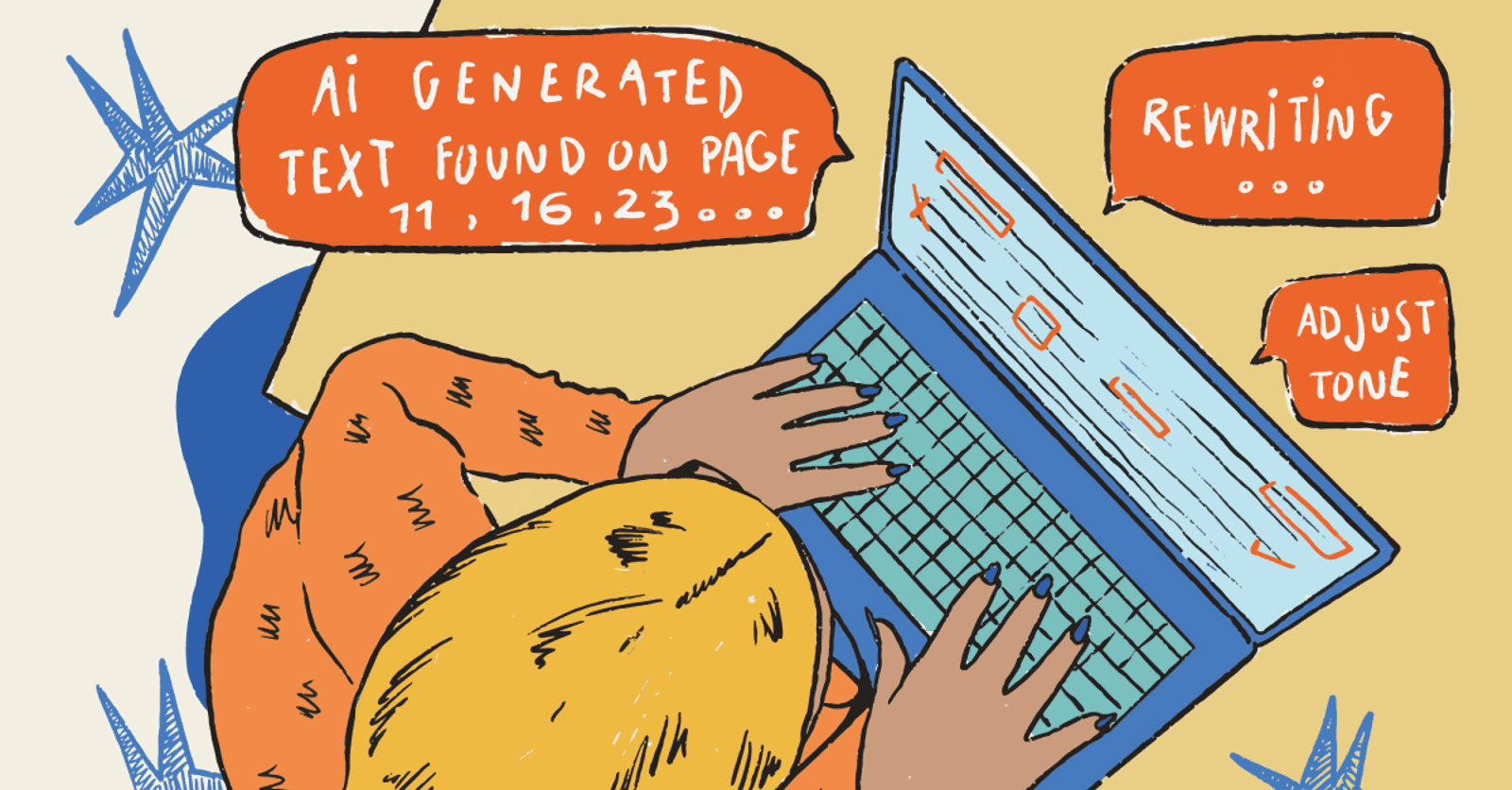
tldr: Making a website mobile friendly in 2026 requires more than responsive CSS. Modern frameworks handle the basics. But AI-generated code (vibe coding) and rapid shipping create new blind spots. Key metrics to hit: 48px minimum tap targets, ≤2.5s Largest Contentful Paint, viewport testing across 5+ device sizes. The real gap is automated verification, not implementation.
Modern web frameworks have essentially solved the "how" of mobile development. Between Tailwind's mobile-first defaults and Next.js's auto-optimized assets, the baseline is high. Yet we're still shipping broken checkout flows to users on $200 Android phones.
Most engineering teams in 2026 have the implementation side figured out. Tailwind is mobile-first by default. Next.js optimizes images automatically. Your component library ships with accessible touch targets. The viewport meta tag comes pre-configured in every starter template. If you're using a modern stack, roughly 70% of "mobile friendly" is handled before you write a single line of code.
The other 30% is where things break. And it's almost never an implementation problem. It's a verification problem. Your code is correct. Your CSS is responsive. But nobody tested the checkout flow on a 375px screen with a slow 4G connection before it hit production. Now you're debugging in prod while customers bounce.

This guide covers the modern implementation baseline briefly. You probably know most of it. The focus is on what most articles skip: how to automatically verify your mobile experience works before users find the bugs.
The 2026 mobile baseline
What modern frameworks handle automatically
First, let's acknowledge what's already solved. If you're building on a modern stack, you're starting with significant advantages:
Next.js, Remix, and Astro handle responsive image optimization out of the box. The <Image> component in Next.js serves appropriately sized images based on viewport, converts formats automatically, and lazy loads by default. You don't have to think about srcset unless you want to.
If you're using Tailwind CSS, you're already thinking mobile-first. When you write text-sm md:text-base lg:text-lg, you're starting from the mobile size and scaling up. The mental model encourages responsive thinking from the start.
Most component libraries ship with the basics covered. shadcn/ui and Radix include accessible touch targets, proper focus states, and keyboard navigation baked in. The buttons are already 44-48px tall. The spacing already accounts for fingers, not just cursors.
The viewport meta tag? Already configured in every modern starter template. Create a new Next.js app, and <meta name="viewport" content="width=device-width, initial-scale=1"> is already in your layout.

We've come a long way from the days of manually hacking together media queries for every device, but that standard baseline has created a false sense of security.
So if the frameworks handle the basics, where do mobile bugs actually come from?
Where mobile bugs actually come from in 2026
The pattern we see repeatedly: the implementation is correct, but edge cases weren't tested. Here are the seven sources responsible for most mobile bugs shipping to production today.
1. AI-generated code edge cases
Copilot, Cursor, and Claude optimize for the happy path. The generated code works on the viewport size visible in your IDE, usually a desktop screen.
Consider the standard AI-generated modal. It looks perfect in a desktop preview, but fails the moment an iPhone SE user tries to dismiss it. The code was optimized for the active viewport in the IDE. The close button renders outside the visible viewport. Backdrop click doesn't work on touch devices without explicit touch event handling.
 source: Claude code
AI-generated forms are particularly prone to this. The default font-size: 14px on inputs looks fine in preview. It triggers auto-zoom on iOS when users tap to type. A jarring experience that makes your app feel broken. The AI didn't know about that quirk. Neither did the developer who accepted the suggestion.
2. Dynamic content overflow
Your design mocks assumed product titles would be 3-4 words. Then a user submits "The Complete and Comprehensive Guide to Understanding Advanced Quantum Computing Principles" and your card layout explodes on mobile.

API responses are worse. Your backend returns a description field that's usually 100 characters but occasionally 2,000. The layout handles the typical case. The edge case causes horizontal scroll.
Internationalization multiplies this problem. German words are roughly 30% longer than English equivalents. "Settings" becomes "Einstellungen." Your nav items that fit perfectly in English wrap awkwardly or overflow in German, French, or Dutch.
3. Touch interaction assumptions
Desktop has hover. Mobile doesn't. This sounds obvious, but the bugs it creates are subtle.
Your dropdown menu shows on hover. On desktop, users see it immediately. On mobile, it requires a tap, but nothing indicates it's tappable, and the first tap might navigate instead of expand. Critical navigation paths become inaccessible.
Tooltips that reveal essential information on hover are invisible on mobile. If that tooltip explains a confusing form field or shows pricing details, mobile users are stuck.
Drag-and-drop interfaces that work perfectly with a mouse often conflict with scroll behavior on touch. The user tries to scroll past your interactive widget and accidentally starts dragging elements instead.
4. Performance on real devices
Your M5 Pro MacBook renders the page in 400ms. The median Android device your users actually own takes 4 seconds.
Heavy JavaScript bundles that execute instantly on your development machine cause multi-second freezes on 3-year-old phones. Images that load immediately on your office WiFi timeout on a 4G connection during a commute.
The performance gap between development environments and real-world conditions has widened. Our machines got faster. The median global device stayed mid-range. Testing on your phone isn't enough. Your phone is probably newer and faster than most of your users' devices.
5. Third-party embeds and scripts
You didn't write the bug. The chat widget vendor did, or the analytics script, or that marketing pixel loading twelve iframes.
Third-party scripts are often untested on mobile viewports. They inject elements that cause layout shifts after page load (destroying your CLS score). They load fonts that delay text rendering. They create fixed-position elements that obscure your content on small screens.
You have limited control over this code, but you own the user experience when it breaks.
6. The mobile z-index war
On desktop, your z-index strategy is straightforward. On mobile, the OS-level UI creates a collision course. The virtual keyboard, browser chrome, and third-party widgets all occupy the same vertical space as your interface.
Your sticky "Add to Cart" button sits at z-index: 1000. The cookie banner loads at z-index: 9999. The chat widget initializes at z-index: 999999. Users on mobile see the Add to Cart button sitting under the cookie banner, or positioned directly over the keyboard input field, blocking what they're typing.
These conflicts rarely show up in static design mocks or desktop testing. The iOS keyboard appears and pushes your fixed-position footer offscreen. Android's navigation bar overlaps your bottom action bar. Safari's dynamic viewport height changes as users scroll, causing fixed elements to jump around.
7. Foldable devices and the death of three-breakpoint thinking
In 2026, "Mobile, Tablet, Desktop" is an outdated triad. Samsung Fold, Pixel Fold, and dual-screen devices are no longer experimental. They're in users' hands. Your checkout button that works perfectly on every device you tested gets split down the middle of a fold.
The hinge creates a physical interruption that CSS media queries don't address. A user unfolds their phone mid-session. Your layout needs to be state-aware, not just size-aware.
The CSS Viewport Segments API handles this:
@media (horizontal-viewport-segments: 2) {
  .checkout-button {
    /* Detect dual-screen layout */
    margin-left: env(viewport-segment-width 0 0);
    margin-right: env(viewport-segment-width 1 0);
    /* Keep critical UI away from the fold */
  }
}
Without this, your call-to-action sits half on each screen. Users tap the left half, nothing happens. The split UI is the horizontal scroll of 2026. It signals you didn't test on real hardware.
Firefox and Chrome support viewport segments on foldable devices. Safari doesn't yet, but feature detection makes the progressive enhancement straightforward:
if ('getWindowSegments' in window) {
  const segments = window.getWindowSegments();
  // Adjust layout for fold
}
The mobile metrics that actually matter
Vague goals like "make it work on mobile" don't help. Here are the specific, testable thresholds you should be hitting.
Core Web Vitals (mobile thresholds)
| Metric | Good | Why it fails on mobile |
|---|---|---|
| Largest Contentful Paint (LCP) | ≤2.5s | Large hero images on slow 4G connections. Unoptimized webfonts blocking render. Heavy JavaScript delaying paint. |
| Interaction to Next Paint (INP) | ≤200ms | Heavy JS main-thread execution on mid-range CPUs. Long tasks blocking user input. Unoptimized event handlers. |
| Cumulative Layout Shift (CLS) | ≤0.1 | Late-loading third-party chat widgets or ads. Images without dimensions. Web fonts causing layout reflow. |
These aren't arbitrary. Google uses them as ranking signals. More importantly, they correlate with bounce rates and conversion. A site that takes 4+ seconds to show meaningful content loses users before they engage.
Energy efficiency and battery impact
Performance in 2026 isn't just about milliseconds. It's about joules. Users are hyper-aware of which apps and sites drain their battery. Your site shows up in iOS Battery Settings if it's consuming excessive power. That's not a badge you want.
Heavy client-side JavaScript doesn't just hurt your INP score. It burns battery. Every framework hydration, every re-render, every heavy computation runs on the user's device, draining their battery faster than it should. Mobile users notice when their phone gets warm browsing your site. They close the tab and don't come back.
The connection is direct: poor INP correlates with high energy consumption. Long main-thread tasks keep the CPU awake and active. Inefficient rendering causes the GPU to work harder than necessary. Third-party scripts you don't control can spike CPU usage unpredictably.
Tools for measuring this are emerging. Website Carbon Calculator estimates your page's carbon footprint based on data transfer and processing. Chrome DevTools Performance panel shows CPU and GPU usage patterns. Safari's Web Inspector includes Energy Impact metrics specifically for battery consumption. Firefox Profiler can identify hot functions burning CPU cycles unnecessarily.

In 2026, energy efficiency is a competitive differentiator. Users choosing between similar products will pick the one that doesn't kill their battery. App Store reviews mention "battery hog" as a deal-breaker. The same thinking is spreading to mobile web.
Mobile-specific requirements
- Tap target size: Minimum 48×48 CSS pixels. This is Google's explicit requirement. Smaller buttons cause mis-taps and frustration.
- Tap target spacing: Minimum 8px between adjacent interactive elements. Without this, users hit the wrong button constantly.
- Input font size: Minimum 16px. Anything smaller triggers auto-zoom on iOS when the input is focused, a disorienting experience.
- Viewport configuration: Must be set, and content must not overflow horizontally. If users can scroll right into empty space, something is broken.
You can check most of these with Google's PageSpeed Insights or Lighthouse in Chrome DevTools. Run both on your homepage and your most critical user flow (signup, checkout, core feature). If either fails on mobile, you have work to do.
Predictive UX and on-device AI
We covered AI-generated code as a bug source. The flip side is AI-powered interfaces as a competitive advantage. In 2026, mobile sites are using on-device AI to predict user behavior and optimize experiences in real time.
Speculative Rules API lets browsers predict which page a user will navigate to next and pre-render it in the background. When the user taps the link, the page appears instantly. This works particularly well on mobile where every saved millisecond matters for perceived performance.
if (document.createElement('script').supports?.('speculationrules')) {
  const specScript = document.createElement('script');
  specScript.type = 'speculationrules';
  specScript.textContent = JSON.stringify({
    prerender: [
      { source: 'list', urls: ['/checkout', '/product-detail'] }
    ]
  });
  document.head.appendChild(specScript);
}
Chrome and Edge support this. Safari doesn't yet. But the progressive enhancement is clean. Supported browsers get instant navigation. Others fall back to normal loading.
WebLLM and on-device models run small language models directly in the browser using WebGPU. This enables predictive UX without round-tripping to servers. A mobile e-commerce site can detect when a user is getting frustrated (repeated back navigation, long hover times without taps) and dynamically reorganize the UI. Move the "Support" button to the top. Surface the search bar. Highlight the return policy link.
On-device inference is already practical thanks to libraries like WebLLM and Transformers.js. Models under 100MB can run on mid-range phones. The UI feels like it's one step ahead of the user.
The trade-off: battery impact and initial load time. A 50MB model takes time to download and initialize. It consumes GPU cycles when running. This is where the energy efficiency discussion loops back. On-device AI can improve UX, but only if implemented carefully. Lazy load the model. Only initialize it if the user shows signs of needing it. Monitor battery drain in Safari's Web Inspector.
The sites winning in 2026 balance predictive intelligence with resource efficiency. Users notice when a site feels "smart." They also notice when their battery drops 20% after five minutes of browsing.
Voice user interface and screenless modes
Mobile-friendly in 2026 isn't just about tap targets. It's about multimodal interaction. With 5G ubiquity and wearable integration, users expect to navigate sites via voice, not just touch.
"Screenless mode" is real. A user walks through a store with AirPods in, phone in pocket, browsing your e-commerce site entirely via voice commands. "Show me blue shirts under $50." "Add the second one to cart." "Check out with saved payment." If your site can't handle this, you've lost a sale.
This requires semantic HTML and proper ARIA labeling. Voice assistants parse your markup to understand what's actionable. A button that looks like a button but is actually a <div onclick="..."> is invisible to voice navigation. A product card without semantic structure can't be referenced by position ("add the second one").
What voice-friendly markup looks like
<article role="article" aria-label="Blue cotton shirt, $45">
  <h3>Classic Blue Shirt</h3>
  <p><data value="45">$45</data></p>
  <button type="button" aria-label="Add classic blue shirt to cart">
    Add to Cart
  </button>
</article>
The aria-label on the button makes it voice-addressable. "Add classic blue shirt to cart" is parseable by voice assistants. "Add to Cart" alone is ambiguous when there are twelve products on screen.
The role and structural elements help voice navigation understand the page hierarchy. "Show me the third product" works because the semantic structure is clear.
Testing voice interactions
Chrome DevTools has experimental voice navigation testing. Safari's VoiceOver (iOS) and Android's TalkBack let you test how screen readers parse your content. These tools approximate how voice assistants will interact with your site.
But the real test is using your site hands-free. Open it on your phone, enable voice commands, and try to complete a purchase without looking at the screen. If you can't, your users on wearables can't either.
The wearable connection
Apple Watch and similar devices render web content in constrained environments. Your mobile-responsive site needs to degrade gracefully to these ultra-small viewports. More importantly, wearables rely on voice for most interactions. A site optimized for screenless navigation works better on wearables by default.
In 2026, "mobile-friendly" increasingly means "works without looking at the screen." Semantic HTML, clear ARIA labels, and logical document structure aren't just accessibility best practices anymore. They're competitive requirements.
Privacy-first design and contextual permissions
With third-party cookies finally dead and Privacy Sandbox rolled out across browsers, mobile users in 2026 are hyper-aware of privacy. A site that immediately bombards them with permission requests feels hostile, not friendly.
The pattern we see too often: site loads, three OS-level prompts fire simultaneously. "Allow Location?" "Enable Notifications?" "Allow Tracking?" The user closes the tab before the page even renders. You've lost them.
Contextual permission requesting is the 2026 standard. Ask for permissions when they're needed, not on page load. Only request what you actually need. Explain why before asking.
Bad permission flow
// Don't do this
window.addEventListener('load', () => {
  Notification.requestPermission();
  navigator.geolocation.getCurrentPosition(() => {});
});
This triggers permission prompts immediately. The user has no context for why you need notifications or location. They tap "Don't Allow" reflexively.
Good permission flow
// User clicks "Get directions to store"
directionButton.addEventListener('click', async () => {
  // Show explanation first
  const proceed = await showModal({
    title: "Location needed for directions",
    body: "We'll use your location once to show directions. Not stored."
  });

  if (proceed) {
    navigator.geolocation.getCurrentPosition(
      coords => showDirections(coords),
      error => offerManualEntry()
    );
  }
});
The user triggered the action. They understand why location is needed. The request has context. Permission grant rates go from 5% to 60%+ with this approach.
Privacy Sandbox and attribution
The Privacy Sandbox (Topics API, Attribution Reporting API) replaces third-party cookies with privacy-preserving alternatives. But implementation matters. Sites that use these APIs transparently gain user trust. Sites that try to reconstruct third-party tracking through fingerprinting get flagged by browsers.
Safari's Intelligent Tracking Prevention, Firefox's Enhanced Tracking Protection, and Chrome's Privacy Sandbox all detect aggressive tracking attempts. Your site gets penalized with degraded features. Storage gets partitioned. Network requests get delayed.
The mobile-friendly approach in 2026 is privacy-by-default. Only collect what you need. Use Privacy Sandbox APIs for attribution and measurement. Be transparent about data usage. Provide a clear privacy policy linked prominently.
The trust signal
Users notice when a site respects their privacy. No permission spam. No surprise prompts. Clear explanations when permissions are genuinely needed. This builds trust. Trust correlates with conversion.
The sites winning in 2026 treat privacy as a feature, not a compliance burden. "We only ask for location when you request directions" is a selling point. "No tracking, no third-party scripts" differentiates your product.
Mobile-friendly increasingly means privacy-friendly. Users expect both.
The implementation essentials
You probably know most of this. Here's the baseline implementation checklist (some team members might reference it later).
The responsive foundation
1. Viewport meta tag
Confirm this exists in your <head>. It should be there already if you're using any modern framework:
<meta name="viewport" content="width=device-width, initial-scale=1">
Without it, mobile browsers render your page at ~980px width and scale down, making everything tiny and unusable.
2. Responsive images
If you're using Next.js, the <Image> component handles this. Otherwise:
<img
  srcset="image-400.jpg 400w, image-800.jpg 800w, image-1200.jpg 1200w"
  sizes="(max-width: 600px) 400px, (max-width: 1000px) 800px, 1200px"
  src="image-800.jpg"
  alt="Descriptive alt text"
>
This serves appropriately sized images based on viewport, saving bandwidth and improving load times on mobile.
3. Fluid typography
Stop hardcoding font sizes. Use clamp() for typography that scales smoothly:
h1 {
  font-size: clamp(1.75rem, 4vw, 3rem);
}

body {
  font-size: clamp(1rem, 2.5vw, 1.125rem);
}
This gives you a minimum, a fluid middle, and a maximum. No media queries required for basic type scaling.
Note on accessibility: When using clamp(), always ensure your base units are in rem rather than px. This ensures that if a user has their system font size set to "Large" for accessibility, your fluid layout respects their choice rather than locking them into your hardcoded pixels.
4. Flexible layouts
CSS Grid and Flexbox handle most layout needs without fixed widths:
.grid {
  display: grid;
  grid-template-columns: repeat(auto-fit, minmax(280px, 1fr));
  gap: 1rem;
}
This creates a responsive grid that adjusts column count based on available space. No breakpoints needed.
5. Touch-friendly targets
Ensure all interactive elements meet the 48×48px minimum:
button,
a,
input[type="checkbox"],
input[type="radio"] {
  min-height: 48px;
  min-width: 48px;
}
The details that break mobile experiences
These are the non-obvious issues that slip through even when the basics are handled correctly.
Prevent iOS input zoom
When input font size is below 16px, iOS Safari zooms in on focus. This is technically "helpful" but feels broken to users. The fix:
input, select, textarea {
  font-size: 16px; /* or larger */
}
If your design requires smaller inputs, you can use @supports to target iOS specifically, but honestly, just make the inputs 16px.
Handle horizontal overflow
If users can scroll horizontally into empty space, something's wrong. This is usually caused by an element with a fixed width wider than the viewport, or negative margins creating overflow.
html, body {
  overflow-x: hidden;
}
This hides the symptom, but you should find and fix the actual cause. Use DevTools to inspect elements at mobile widths and find what's extending beyond the viewport.
Safe area insets
Modern phones have notches, rounded corners, and home indicators that obscure content. Use environment variables to account for them:
.fixed-bottom-bar {
  padding-bottom: env(safe-area-inset-bottom);
}

.full-height {
  min-height: calc(100vh - env(safe-area-inset-top) - env(safe-area-inset-bottom));
}
Handle hover states on touch devices
Don't hide critical information behind hover:
@media (hover: none) {
  .tooltip {
    /* Show by default on touch devices, or make tap-accessible */
  }

  .dropdown-trigger:hover + .dropdown {
    /* This won't work - need tap/focus alternative */
  }
}
Better yet: design interactions that work for both input types from the start.
Lazy load below-the-fold content
Native lazy loading is well-supported now:
<img src="image.jpg" loading="lazy" alt="...">
For iframes (embedded videos, maps):
<iframe src="..." loading="lazy"></iframe>
This dramatically improves initial load time on mobile connections.
The testing-first approach
Here's the uncomfortable truth: you can implement everything above correctly and still ship broken mobile experiences. Implementation doesn't guarantee functionality. Only testing does.
Why "it works on my phone" isn't testing
The device fragmentation problem is real. There are over 10,000 distinct Android device models in active use. Screen sizes range from 320px to 430px+ on phones alone. iOS versions span 4+ years of releases. Each combination can surface unique bugs.
Your phone isn't your users' phone. You're probably testing on a relatively new device, on fast WiFi, with a few apps in memory. Your users are on 3-year-old Androids, on cellular connections, with 47 apps running in the background.
The CI/CD gap
Modern teams test code obsessively. Every PR runs unit tests, integration tests, type checks, linting. APIs get contract testing. Backend logic gets coverage reports.
UI across viewports? "Someone will check it manually before release." This gap in pull request testing leaves mobile bugs undetected until production.
This creates what we call Mobile Debt: the accumulating gap between your shipping velocity and your mobile verification coverage. If you're deploying daily but only testing mobile weekly, bugs are reaching production undetected.
The median startup we work with discovers 60-70% of their mobile bugs from user reports, not internal testing. That's backwards. Users shouldn't be your QA team.
Automated mobile viewport testing
The solution is treating mobile viewports like any other test dimension: automated, repeatable, and integrated into CI.
The approach
-
Define your critical user flows: Signup, login, core feature usage, checkout (if applicable). These are the paths where mobile bugs cost you users and revenue.
-
Run those flows across multiple viewport sizes automatically: Not just "desktop" and "mobile," but specific widths that represent your actual user base.
-
Integrate into CI: Every PR should run viewport tests. If the signup flow breaks on a 375px screen, the PR doesn't merge.
Viewport matrix to cover
| Device | Width | Height | Category |
|---|---|---|---|
| iPhone SE | 375px | 667px | Small mobile |
| iPhone 14 Pro | 393px | 852px | Standard mobile |
| Pixel 7 | 412px | 915px | Standard Android |
| iPad Mini | 768px | 1024px | Tablet portrait |
| iPad Pro | 1024px | 1366px | Tablet landscape |
At minimum, test at 375px (small mobile), 390-414px (standard mobile), and 768px (tablet). This catches most layout issues.
What to verify at each viewport
- Layout integrity (no horizontal scroll, no overlapping elements)
- All interactive elements visible and tappable
- Text readable without zooming
- Forms completable with mobile keyboards
- Navigation menus accessible and functional
- Critical flows complete end-to-end
You can build this with Playwright or Cypress. Set viewport sizes in your test configuration and run your existing E2E tests across each. For Playwright:
const devices = [
  { name: 'Mobile', viewport: { width: 375, height: 667 } },
  { name: 'Tablet', viewport: { width: 768, height: 1024 } },
  { name: 'Desktop', viewport: { width: 1280, height: 720 } },
];

for (const device of devices) {
  test(`checkout flow - ${device.name}`, async ({ page }) => {
    await page.setViewportSize(device.viewport);
    // ... test steps
  });
}
This works but requires ongoing maintenance as your UI evolves. Tests break when selectors change, when flows update, when new features ship. Someone has to fix them, and that someone is usually your senior engineers. The last people who should be wasting cycles on flaky E2E selectors.
Tools like Bug0 Studio take a different approach: describe flows in plain English ("complete the checkout process," "verify the user can sign up with email"), and the platform runs them across viewports automatically, self-healing when UI changes. When a flow breaks, you get a video recording, screenshot, and the exact step that failed, not a cryptic selector error. Learn more about how Bug0 Studio works and how it handles AI-powered test generation.
Visual regression testing for responsive design
Beyond functional testing, visual regression catches layout bugs that might not break functionality but damage user experience. Here's the process:
- Capture baseline screenshots of key pages at each breakpoint
- On each PR, capture new screenshots at the same breakpoints
- Automatically diff them, highlighting visual changes
- Flag changes for human review
Your desktop layout might look fine while mobile is broken. A CSS change that tweaks spacing might look intentional at 1200px but cause text truncation at 375px. Without visual comparison across breakpoints, these regressions slip through.
Visual regression also documents how your UI looks across devices, useful for design reviews and catching unintended drift over time.
Tools: Percy and Chromatic are popular SaaS options. Playwright has built-in screenshot comparison. Bug0 includes visual regression as part of its test runs.
Real devices vs. emulators
A common question: do you need to test on real devices, or are emulators enough?
Emulators (Chrome DevTools, Playwright) handle layout testing, viewport simulation, and functional verification. They're perfect for catching most issues. But they don't give you real touch events, real performance characteristics, or real browser quirks.
Real devices (physical or cloud) are the opposite. Great for performance validation, touch gesture testing, and browser-specific bugs. But they're expensive to maintain, slow to run, and harder to automate.
The practical approach
Use emulators for CI. They're fast, automatable, and catch 80%+ of issues. Run viewport tests on every PR with simulated devices.
Use real devices for pre-release validation. Before a major launch, test critical flows on at least one iOS device and one mid-tier Android (not a flagship, something closer to what average users have). This catches the remaining performance and interaction bugs that emulators miss.
If you need scale, services like BrowserStack and Sauce Labs provide real device clouds. For teams evaluating testing infrastructure, our comparison of LambdaTest vs BrowserStack vs Bug0 explores different approaches to scaling mobile testing. But for most teams, a couple physical devices for spot-checking, combined with automated emulator testing in CI, covers the bases.
The 10-point mobile verification checklist
Use this before any significant release. Each item includes what to check, how to test it, and what "pass" looks like.
1. Viewport configuration
- Check: View page source, look for
<meta name="viewport"> - Pass:
width=device-width, initial-scale=1is present
2. No horizontal scroll
- Check: Load at 375px width, try to scroll horizontally
- Pass: No content extends beyond viewport edge
3. Tap target size
- Check: Lighthouse → Accessibility → "Tap targets are sized appropriately"
- Pass: All interactive elements ≥48×48px
4. Tap target spacing
- Check: Lighthouse audit or manual inspection
- Pass: ≥8px between adjacent interactive elements
5. Readable text without zoom
- Check: Load page at mobile width, read without pinch-zoom
- Pass: Body text ≥16px, sufficient contrast, no truncation hiding content
6. Forms completable on mobile
- Check: Fill out every form on mobile/emulator
- Pass: No zoom on input focus, correct keyboard types shown, submission works
7. Navigation accessible
- Check: Open mobile nav, test all menu items
- Pass: Menu opens reliably, all links tappable, menu closes properly
8. Images load and scale
- Check: Lighthouse performance audit + visual inspection
- Pass: No broken images, no overflow, loads within 3s on 4G
9. Core Web Vitals pass
- Check: PageSpeed Insights, select "Mobile"
- Pass: LCP ≤2.5s, INP ≤200ms, CLS ≤0.1
10. Critical flows complete end-to-end
- Check: Automated tests or manual verification across viewports
- Pass: Signup, login, and core features work on 375px, 390px, 768px screens
Moving toward verification-first
By 2026, the "mobile-friendly" bottleneck has shifted. It's no longer about whether your CSS can handle a media query. It's about whether your CI/CD pipeline can prove it works before the first user hits the page.
The implementation side is largely solved. Modern frameworks, utility-first CSS, and component libraries give you responsive foundations out of the box. Most teams aren't failing to implement mobile support. They're failing to verify it works across the range of devices, viewports, and network conditions their users actually have.
The fix is treating mobile viewports like any other test dimension: automated, integrated into CI, and run on every PR. Define your critical flows, run them across 3-5 viewport sizes, and catch bugs before users do.
Start with the 10-point checklist above. Set up automated viewport testing in your CI pipeline, whether that's Playwright scripts you maintain, or a tool like Bug0 that handles the maintenance for you. If you're an early-stage team without dedicated QA resources, learn how to set up web app testing in one week using AI-powered QA. Aim for every PR tested across at least three viewports before merge.
Forget how the site looks in a desktop emulator. If you haven't run your checkout flow through a 375px viewport in CI, you don't actually have a mobile-friendly site.
FAQs
How do I test if my website is mobile friendly?
Start with Google's PageSpeed Insights for a quick audit. It gives you Core Web Vitals scores and specific issues to fix. Run Lighthouse in Chrome DevTools for more detail. For ongoing verification, set up automated end-to-end tests that run across viewports in CI using Playwright, Cypress, or Bug0.
What's the minimum screen width I should test?
320px is the absolute floor (older iPhone SE, some small Androids). Realistically, 375px covers most modern small phones. Your testing matrix should include 375px, 390-414px (standard mobile range), and 768px (tablet). Check your analytics to see which widths your actual users have.
Do I need to test on real devices?
Emulators catch most layout and functional issues and are better for CI automation. Real devices are valuable for performance testing and validating touch interactions feel right. A practical approach: automated emulator tests in CI for every PR, plus manual real-device testing before major releases.
How often should I test mobile compatibility?
If you have automated viewport testing in CI: every PR. If you're testing manually: at minimum, before every release. The goal is catching mobile bugs in development, not production. Users should not be your QA team.
What's the difference between responsive and mobile-friendly?
Responsive means the layout adapts to screen size. Mobile-friendly means the experience actually works well: fast loading, touch-friendly, readable, functional. A site can be technically responsive (layout reflows, images resize) but still mobile-unfriendly (tap targets too small, performance terrible on real devices, critical features broken at certain widths).
Do I need to support foldable devices like Samsung Fold?
If you have users on foldable devices (check your analytics), yes. The CSS Viewport Segments API lets you detect dual-screen layouts and keep critical UI away from the hinge. Firefox and Chrome support it. Without foldable support, your call-to-action buttons can get split across the fold, making them unusable. Test with Chrome DevTools' dual-screen emulation.
How do I measure if my site is draining battery?
Use Safari's Web Inspector Energy Impact metrics or Chrome DevTools Performance panel to monitor CPU/GPU usage. Look for sustained high CPU activity during idle states. Tools like Website Carbon Calculator estimate energy consumption. If your INP is poor (over 200ms), you likely have battery drain issues. Test on a real device and monitor battery percentage over a 5-minute browsing session.
Should my site work with voice navigation?
In 2026, yes. With screenless modes and wearable integration becoming standard, voice navigation is no longer optional. Use semantic HTML and proper ARIA labels so voice assistants can parse your content. Test with VoiceOver (iOS) or TalkBack (Android). If users can't complete your checkout flow hands-free, you're losing sales to competitors who support it.
How should I handle permission requests on mobile?
Never request permissions on page load. Use contextual requesting: ask for location when the user clicks "Get directions," not when they land on your homepage. Explain why you need each permission before requesting. Permission grant rates jump from 5% to 60%+ with contextual requests. Sites that spam permission prompts get penalized by browser tracking protection.